
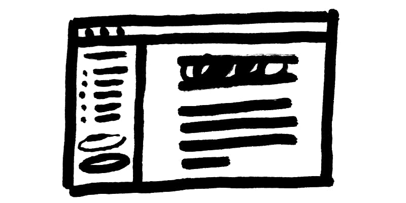
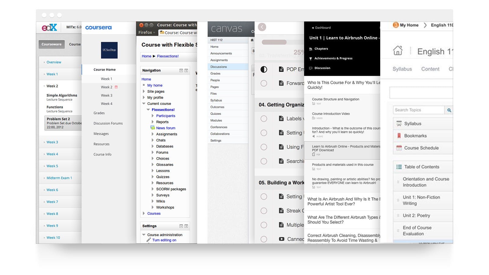
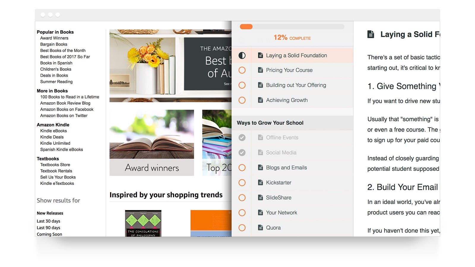
If you’ve ever taken an online course, you’ve come across this interface design pattern. This sidebar + content pattern is used by almost all online course software:
Naturally, we get asked why courses in Pathwright don’t include a sidebar. Fair question. I’ll share two reasons why I think it’s time for course designers to break up with their sidebars.
1) Sidebars make it harder to learn
Whenever we learn something new, our brain uses all our available mental energy on that task. We call this kind of mental energy “working memory.” Psychologists quantify how much working memory is required to learn a concept as “cognitive load.” Higher cognitive load = harder to learn. Here’s the formula:
Cognitive load = Innate load + Germane load +Extraneous load.


Now here’s what that means in plain english:
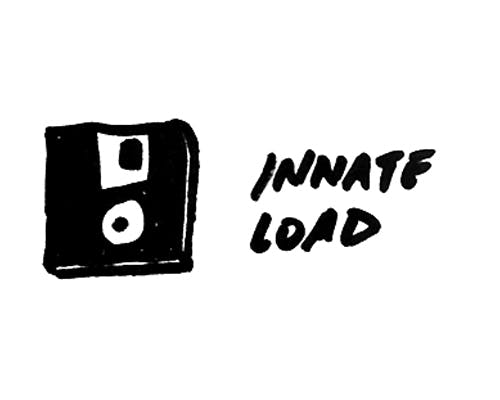
- Innate load increases with the complexity of the concept itself. We could think of innate load as the “file size” for an app we’re installing into our brain (e.g., mixing cooking ingredients is small while deciphering a physics equation is big).
- Germane load is how difficult it is to merge the new concept in with what we already know. It’s kind of like the processing power required to “install” that file into our brain.
- Extraneous load is everything else distracting us from learning the concept.
As teachers, we can use smart course design techniques to subtract strain on our learners by reducing each load—that’s a good topic for another post. For now, here’s a very important fact to keep in mind about your online course:
Your learners are already in the most distracting place that’s ever existed: The Internet.
They’re only a tap, click, or notification away from everything other than what you’re teaching. Extraneous load is sky high.
With this in mind, Pathwright’s interface designers hunt down and kill extraneous load wherever it’s found. If it’s not essential, it gets axed. So even though course sidebars may be the cool kid everywhere else, they don’t make the cut here.
But isn’t that a little harsh? Can’t our learners just ignore the sidebar while they’re reading, watching, etc.? Sure they can, but that sidebar is still acting like the annoying kid whispering in the back of the class during a test. If your online course has a sidebar, it’s whispering to your learners:
😈 “Pssst. Is that quiz too hard right now? I got you. Why not check out something else for a little while?”
A lurking sidebar is an invitation to stop learning. It steals away your learner’s scarce cognitive load from your teaching. It’s a small thing, but the devil is in the details.
2) A course is more than organized content
“Dress for success.” “You are what you wear.” We know that how we dress says something about us to other people even when it’s unfair or inaccurate. Here’s what dressing up your course with a sidebar says about your course:
😈 “Let’s shop around. Check out this menu of shiny options over here. You can pick whatever you want, anytime.”
The problem here is that order matters in an effective course. Learning requires connecting past knowledge with new knowledge progressively. Give your learners an ever-present chance to skip around, and they’ll miss those essential connections.
😈 “It’s all about the content, baby. Just look at all this content I’ve got for you! It’s so good. I’m gonna keep it in your face all the time.”
But learning isn’t about content. It’s about absorbing, reflecting, practicing, observing, doing, reviewing, etc. — all actions connected in an intentionally designed sequence (or, ahem, a “path”). If an online course is dressed up like it’s all about the content, it’s easy to forget about following a path altogether.
This is about more than 😈 sidebars
Interface design for online education is in its infancy. We have a lot more work to do, and breaking up with course sidebars is just a small step.
Unfortunately, many good interface designers are slapping together popular UI patterns that work great for exploring an online store or blog without thinking about how those patterns impact learning.
At Pathwright, we don’t get everything right either. But we start by taking a design approach that begins with what’s best for you as a teacher and for your learners—not what’s expected or popular.
If you’d like to try out the difference for yourself, you can start creating an online course for free right now.
Using Pathwright is dead simple and doesn’t cost a thing until you’re ready to launch a path.
Get startedTopics in this article