

In my heart (and based on two degrees), I’m a graphic designer. That’s why it’s weird for me to say that, when you use Pathwright, you probably won’t have to pay someone like me.
For years, I’ve worked with our team to make Pathwright pretty from your first login. But you may not know that you can take your school to the next level totally on your own.
Truly intuitive? So beautiful it blows your hair back? Tweak five simple settings to throw just the right mood in seconds.
1. Course Cover
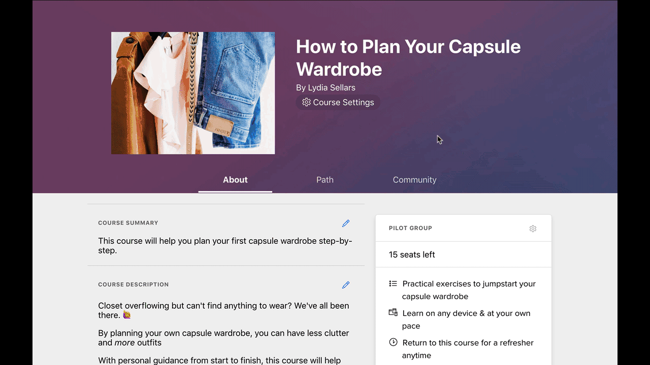
When you create online courses with Pathwright, each course is automatically given one of 72 different colorful course covers. These course covers act like book or album covers. They give learners and staff alike a visual cue by which to remember the topic or content.
That’s a great start. But when you’re ready to really make courses your own, adding custom covers makes a big impact on how learners perceive them. You may have brand assets already at your fingertips, or you may want to turn to resources like Flickr Commons or Unsplash for great, free images.
We wrote detailed guidelines for adding custom covers here. Here’s the 5 second version:

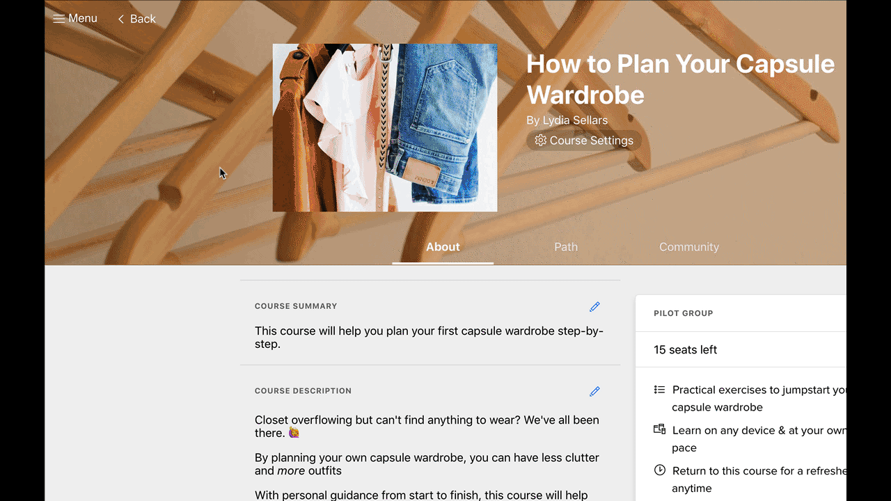
2. Course Background
You’ve got two great options. First, reusing your course cover with blur turned on makes the most sense for course backgrounds. Most course designers do this. But second, if you turn blur off, you’ll see a nice banner appear across the top of the path where the general info is.
Going the banner route takes a bit more planning not to render the course title unreadable. In most cases, you likely won’t encounter that problem. But think of it as more of a pro move.
To me, the best course backgrounds share three qualities:
- Dramatic variation or unity in color
- Use mostly midtones, not bright highlights or deep shadows that create too much contrast
- Don’t contain an overwhelming amount of detail

On the left, we've used an image with one main color. On the right, we've gone with an image that really runs the gamut.

On the left, the image is way too extreme in highlights and shadows. On the right, we've maintained reasonable contrast.
Here’s how to add a course background like that:
3. Account Icon
Your account icon is what most of your people will think of as the school itself. It’s like a social media avatar mixed with an app icon.
Often, using your logo makes the most sense here. If you don’t have a logo or don’t want to use it, anything memorable will do. Keep in mind that this will be seen during login and in discussions, so it’ll be small but important.
If you’re not sure what to do for an account icon, a memorable solid color or shape (or both!) works nicely. Here’s how to add an account icon:
4. Account Background
Account backgrounds show at login for everyone. But if you're staff, you'll also see these special backgrounds on your dashboard. In both places, they fill the entire background, making this a simple way to set the right branded tone.
The most effective account backgrounds are a lot like course backgrounds—mostly midtones, limited detail. But in contrast to course backgrounds, choosing an image with a single dominant color can be an effective unifier.
Here’s how to add an account background:
5. Account Primary Color
This is one of those “cherry atop the sundae” settings. Whatever color you choose for your account’s primary color will instantly be applied to almost every link and button. It’s a quick way to really make Pathwright your own.
Brands typically have a main color. Usually, that’s the right color to use for this setting. But watch out: Black, red, and very light colors don’t work best.
- Black doesn’t read as a clickable link very well.
- Red makes every clickable option look dangerous.
- Very light colors won’t even show up on lower-end screens or may look strange on mobile devices.
In these cases, reach for your brand’s secondary color. Using this as an opportunity to carve out a sub-brand for your Pathwright account can be an interesting direction, too.
That’s it! These five simple settings turn Pathwright into your own custom-branded app. We’re always working on more ways to make our platform the perfect canvas for your team, so let us know what we’re missing! Tweet at us or send us messages through Support with any ideas.
If you're keen to explore more, check out our Support article on everything you can brand with your Pathwright account.
Using Pathwright is dead simple and doesn’t cost a thing until you’re ready to launch a path.
Get startedTopics in this article