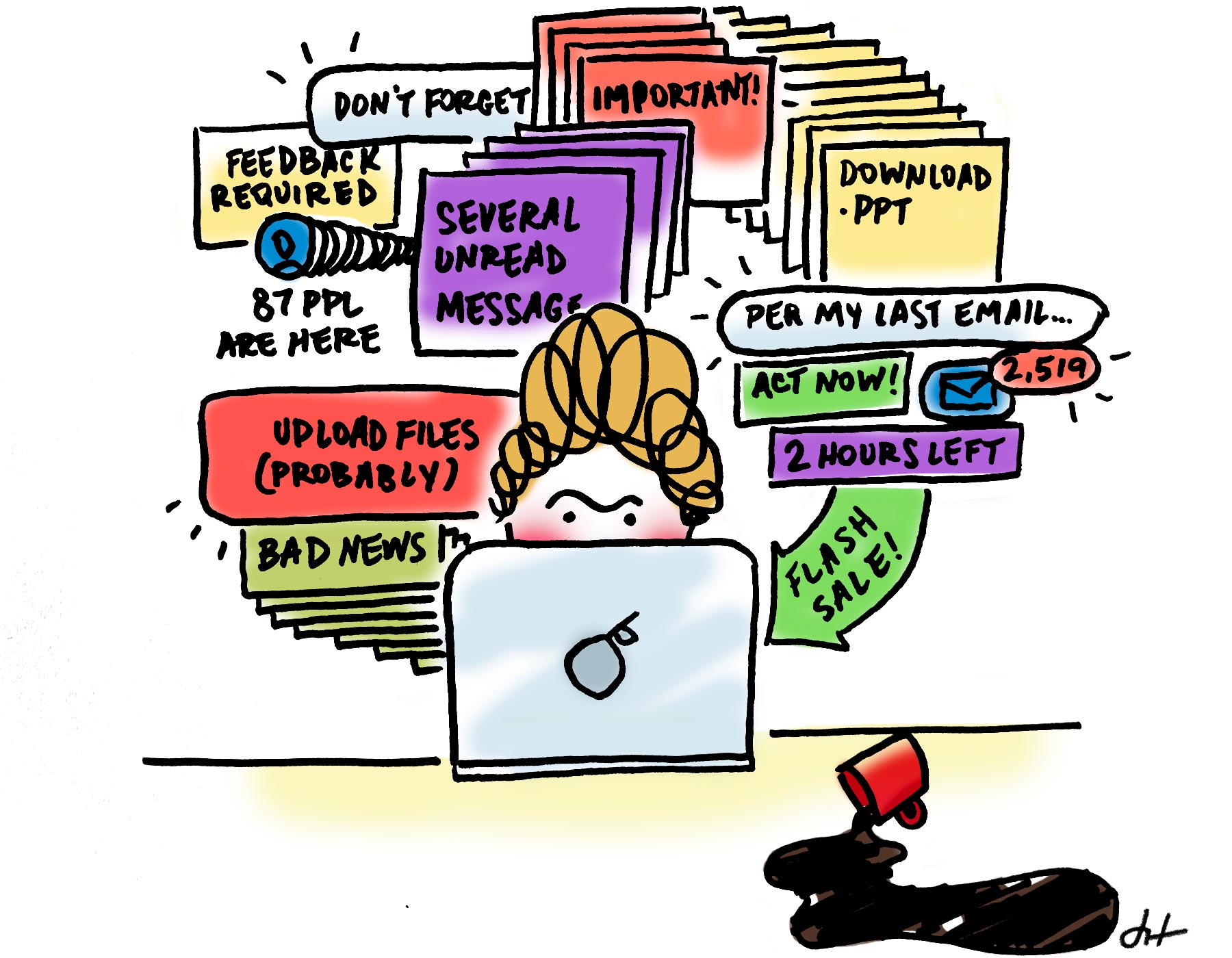
Software shouldn’t be hard.
Logging in should be easy. Click, in, done.
Seeing what’s next should be easy. Onward!
Finding feedback should be easy. “There it is!”
Updating a learning step should be easy. Published, no ambiguity.
Discussing an idea should be easy. “What does it mean when...” and posted.
All of this should be easy. As easy as humanly, technologically possible. It has to be. Because—woof, this is really the heart of it all—gaining understanding is hard.
And, often, the more valuable the information, the more difficult its acquisition. Regrettably.
It’s not fun that it’s hard, but boy is having learned something fun. Learning to read isn't fun, but reading The Martian for the first time sure is. Skinned knees aren't fun, but riding a bike once you know how sure is. Digging your treads into step after step through the forest isn't fun, but planting your feet on a peak in the Appalachians sure is.
The view has a lot to do with the climb.
On our side, we pour hours into simplifying the buttons, screens, and steps required to teach and learn. That list from the top? They're operations everyone has to perform. Our job is to make them as easy as possible.
Learning is hard, but there’s no reason the software surrounding it should be. Just like The Martian should be nicely typeset, bike chains should come oiled, and hiking boots should grip even on an incline. And they all do, because great journeys rely on great tools that just work.
They should make it easy to get to down to business.
Save the grit for understanding.
With the best tool around for designing understanding, what will you create?
Further Reading


